Product and Category Layouts
There are various layout possibilities for the categories, products and product detail pages. These can be set up by modifying or adding to the parameters in the file vsadmin/includes.asp or includes.php. There are also tweaks that can be made through the CSS file for fine tuning the presentation and these are outlined in the css help page.
The category layouts
It is possible to show the categories in multiple columns. The parameter you would need to use here would be
ASP version -> categorycolumns=1
PHP version -> $categorycolumns=1;
...where "1" is the number of columns that will appear on categories.asp / categories.php
Here is an example of the setting categorycolumns=3
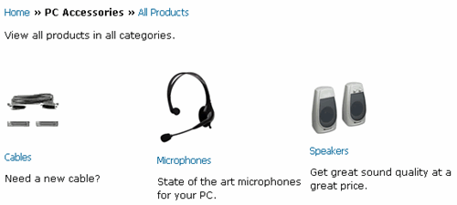
Example taken from our demo store. (This example changes from time to time)
If you are using a multiple column category layout then you will probably want the category name and description below the category image as in the example above. To achieve this look you will need the following setting in vsadmin/includes.asp or includes.php
ASP version -> usecategoryformat=3
PHP version -> $usecategoryformat=3;
If you want the category image to the right of the category name and description then you will need to set...
ASP version -> usecategoryformat=2
PHP version -> $usecategoryformat=2;

Example taken from our demo store. (This example changes from time to time)
The final option is to show the image to the right of the category name with the text below
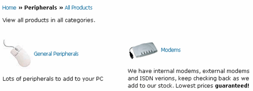
For this layout you will need the following setting
ASP version -> usecategoryformat=1
PHP version -> $usecategoryformat=1;
Example taken from our demo store. (This example changes from time to time)
The product layouts
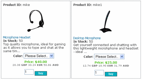
As with the category page it is also possible to put the products into multiple columns on the products page. To achieve this layout you will need the following in vsadmin/includes.asp or includes.php
ASP version -> productcolumns=2
PHP version -> $productcolumns=2;
Example taken from our demo store. (This example changes from time to time)
In the example above the product name, description, options and price are displayed below the product image. This is achieved by the following setting
ASP version -> useproductbodyformat=2
ASP version -> usesearchbodyformat=2
PHP version -> $useproductbodyformat=2;
PHP version -> $usesearchbodyformat=2;
This lends itself to multiple column layouts as it provides more space on the page. Note the use of searchbodyformat as the results on the search page can be tweaked in the same way.
The following CSS was used to achieve the formatting above
...for the price
span.price, .detailprice, .prodprice {
color: #44BA04;
padding-top: 4px;
font-weight:bold;
text-align: center;
}
...for the alternative currency
div.prodcurrency {
font-size: 10px;
font-family : Verdana,Arial,sans-serif;
color: #666;
text-align: center;
width: 100%;
}
...for the border around the product information (in includes.asp / .php make sure that innertablespacing is set to above zero eg 3)
td.product {
border: 1px dotted #3B4754;
background-color: #FFF;
}
It is also possible change the layout to have the product picture to the left of the name and description.

Example taken from our demo store. (This example changes from time to time)
The setting for the layout above would be
ASP version -> useproductbodyformat=1
ASP version -> usesearchbodyformat=1
PHP version -> $useproductbodyformat=1;
PHP version -> $usesearchbodyformat=1;
Please note that with the useproductbodyformat set to 1 the productcolumns setting will be ignored.
The following CSS was used to achieve the formatting above
...for the price
span.price, .detailprice, .prodprice {
color: #44BA04;
padding-top: 4px;
font-weight:bold;
text-align: center;
}
...for the alternative currency
div.prodcurrency {
font-size: 10px;
font-family : Verdana,Arial,sans-serif;
color: #666;
text-align: center;
width: 100%;
}
...to top align the product picture
.prodimage {
vertical-align : top;
}
There is one more radically different layout option for the products page and this is in a table format.
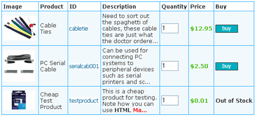
Example taken from our demo store. (This example changes from time to time)
It is possible to choose which columns to display so you can show as much or as little information as you require. The various column options are outlined here for the ASP version and here for the PHP version.
To specify the table layout, the following will need to be set in vsadmin/includes.asp or includes.php
ASP version -> useproductbodyformat=3
PHP version -> $useproductbodyformat=3;
The following CSS was used to achieve the formatting above
...for the darker blue cell border lines
.cpd {
background : #29ADFF;
}
...for the light blue background cells
.cpdll {
background : #F1F9FC;
color: #333;
}
...for the column header cells
.cpdhl {
background : #FFF;
color: #333;
font-weight: bold;
}
Please note there are more special CSS classes that correspond to this particular layout.
The product detail layout
There are two possible product detail layouts. If you want the product picture to the left of the product name and description, then you will need the following
ASP version -> usedetailbodyformat=2
PHP version -> $usedetailbodyformat=2;
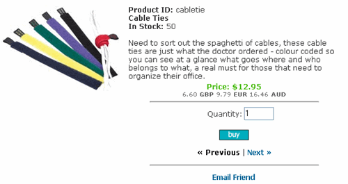
Example taken from our demo store. (This example changes from time to time)
The following CSS was used to achieve the formatting above
...for the price
span.price, .detailprice, .prodprice {
color: #44BA04;
padding-top: 4px;
font-weight:bold;
text-align: center;
}
...for the alternative currency
div.prodcurrency {
font-size: 10px;
font-family : Verdana,Arial,sans-serif;
color: #666;
text-align: center;
width: 100%;
}
...to top align the product picture
.detailimage {
vertical-align : top;
}
If you want the product picture above the product name and description then you will require the following in vsadmin/includes.asp or includes.php
ASP version -> usedetailbodyformat=1
PHP version -> $usedetailbodyformat=1;
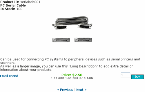
Example taken from our demo store. (This example changes from time to time)
The following CSS was used to achieve the formatting above
...for the price
span.price, .detailprice, .prodprice {
color: #44BA04;
padding-top: 4px;
font-weight:bold;
text-align: center;
}
...for the alternative currency
div.prodcurrency {
font-size: 10px;
font-family : Verdana,Arial,sans-serif;
color: #666;
text-align: center;
width: 100%;
}
Tips and tweaks
Many of the tweaks made to the layouts can be achieved through the CSS file and we have outlined all the CSS classes in our CSS reference page.
It is possible to experiment with those classes to get the look you are after. For example if you want to place a thin border around the products as in the example here

... you would add the follow to your css file (in includes.asp / .php make sure that innertablespacing is set to above zero eg 3)
td.product {
border: 1px dotted #3B4754;
background-color: #FFF;
}
As you can see on our demo store, (This example changes from time to time), we have used various layout options on the same store. This is achieved by setting the pages up as static pages, which means we can edit the pages individually. As an example, you can see that we have set this page up to use the table layout for products. To do this for the ASP version we used the following code
<%
useproductbodyformat=3
explicitid=13
%>
<!--#include file="vsadmin/inc/incproducts.asp"-->
For the PHP version that would be
<?php
$useproductbodyformat=3;
$explicitid=13;
?>
<?php include "vsadmin/inc/incproducts.php"?>

